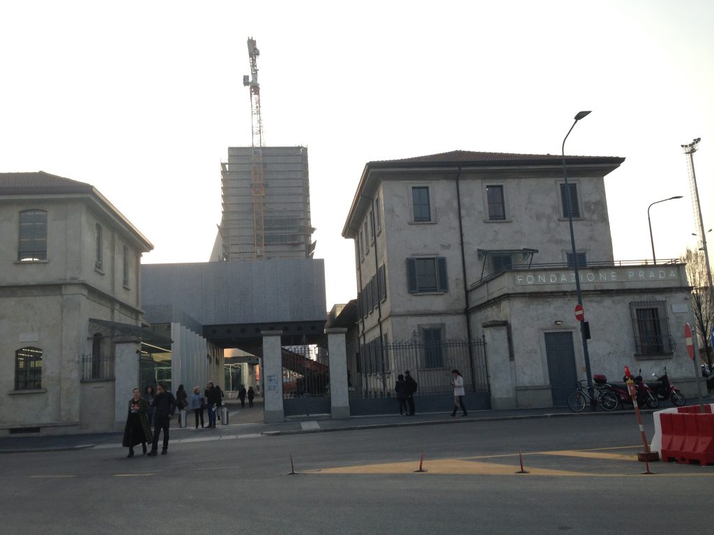
Given the name of the foundation, the address where it is located is surprising. Yes, Fondazione Prada was actually founded by the same Prada of the fashion brand. But no, you won’t find the building in Via Montenapoleone — the upscale shopping street in Milan. Unexpectedly, the private institution is situated in an industrial area in South Milan, far away from anything resembling an haute-couture boutique.
Walking down a large street overlooking train rails, you end up in a dusty crossroad called “Largo Isarco”. The entrance of the complex, a 1910s distillery, has not been dramatically altered. At first, the mark of archistar Rem Koolhaas, whose architecture firm redesigned the building, was nowhere to find.

However neon signalling Fondazione Prada was unequivocal, as was the well-dressed crowd. “This must be it”, I told my curator friend while we entered the courtyard. A 4-story building started looming in front of us, finally giving us a hint of the real nature of the place. The building, called the “Haunted House”, was completely clad in 24 carat gold foil.
Not what it seems
In that moment, what came to my mind was the placid, wide-eyed, juvenile face of political thinker Alexis de Tocqueville. In his seminal book “De La Démocratie en Amérique”, the French intellectual observed how in mid 19th century America, unlike Europe, everybody seemed to enjoy an equalitarian status. This equality, though, was just apparent. The differences between classes were still there, only they were not so blatant. In his view that was harmful, as it deluded people.
Alexis would have agreed that Fondazione Prada, with its golden Haunted House tucked in the industrial periphery, was just as ambiguous. Rem Koolhaas decided to play a game of contrasts fashion designers have been playing for a very long time. You might dress in plain vintage grey and camel frocks, but then you take off your scarf, revealing a 24-carat golden necklace. It is a way of saying: look, I’m like you, but not quite.
Does it completely come as a surprise? Well, it’s like when you first met that understated friend of yours from a very good family. You might have already caught some signs at a subliminal level revealing her for who she was. Maybe it’s shoes. Maybe it’s the way she articulates sentences. Or maybe it’s that savoir faire at social gatherings. Where in the world did she learn that? Certainly not at the pro-migration rally you two met.
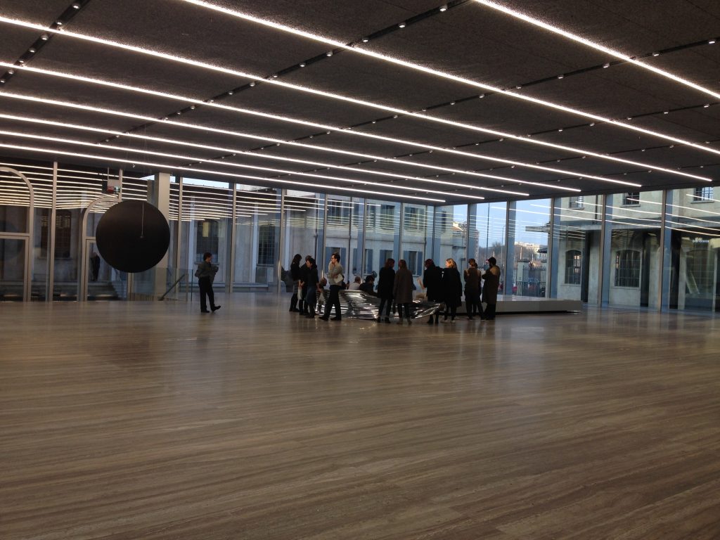
At Fondazione Prada specifically, these subtle signs are the resin fillings in the travertine floor. Or the vintage perfection of the formica tables and pinball machines in the bar. A tad too perfect to be accidental. After all, the devil is in the details.
Inclusive Art, Exclusive Art
At this point there is no doubt about it: Fondazione Prada is an exclusive space which presents itself as inclusive. To understand what “inclusive” and “exclusive” mean in relation to art, we have to look at the current state of contemporary art.
Nowadays, contemporary visual art is no longer defined by movements such as impressionism, cubism, or surrealism. The so-called avant-gardes are last century’s business. The mark of today is to find in the political tendencies surrounding the art, rather than in the form of the artworks themselves. These political tendencies are primarily evident in the way art is showcased.
The two major orientations are inclusive art and exclusive art. The first is all about creating work which is community-based, interactive, understandable and available to everyone. An exclusive attitude would treat art with reverence and religiosity, consequentially building a set of rules to protect it. The artwork tends to be conceptual and detached from the mundane, usually making the viewer uneasy around it.
To the Son of Man Who Ate the Scroll
As exclusive as it was, the Fondazione Prada insisted in understating itself. The cage-looking cloakroom, for example, belonged more to an ‘90s disco rather than an art foundation. At the entrance of the first exhibition space, my friend and I are greeted by a guy in a grey uniform, similar to a factory worker, a mechanic or a bureaucrat. It was the aestheticism of the working class right from a designer’s mood board.
People dressed in bureaucratic uniforms were pretty much at every door, in every room, in front of almost every artwork. While it’s common in museums and foundation to have a guy or two looking after the art (quite understandably, you don’t want someone to jump head-first onto a canvas), it felt here they were mainly patrolling.
I didn’t acknowledge the looming presence of the guards/bureaucrats in the beginning, because I was so taken by the exhibition. Beautiful, thought-provoking and certainly quite intellectual, Goshka Macuga’s “To the Son of Man Who Ate the Scroll” was presented in the three different exhibiting spaces within the Fondazione.

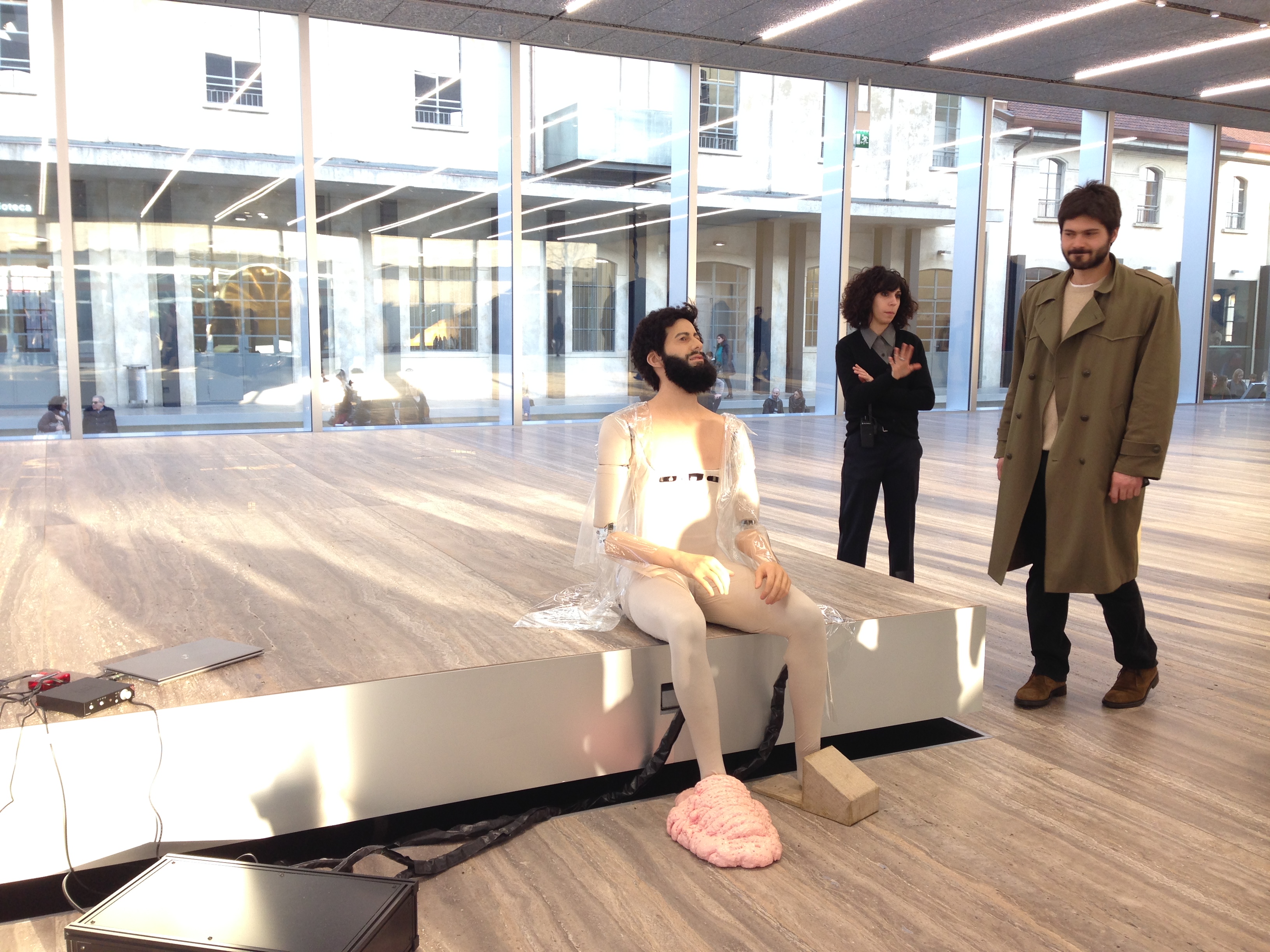
The show aimed to represent pan-knowledge. In the main space, I was attracted by a gathering of people at the centre of the gallery, some sitting, other standing. They were all listening to the soothing voice of a bearded guy that was preaching in an ancient Greek philosopher’s fashion.
Once again, things were not as they seemed. As I came closer, I realized the philosopher was a robot, though incredibly realistic, with expressions, gestures and everything. It was quoting different philosophers and taking from them to explain what means to be human. “Us humans”, it was saying.
Listening to him was fascinating. The android had the confident emphasis of a Ted speaker. What it said rang true to me, and certainly to the audience too — it’s rare to see people spend all this time with a work. I quickly forgot I was in the presence of a robot.
Even though in the beginning I couldn’t point out at any exact factor, I walked away from the artwork to the next room with a general feeling that something wasn’t quite right. I felt tricked. The philosopher was reiterating important truths I genuinely connected with, but it was only a container. It was just the form of a wise person, without the soul of a human being. It was a bit like Fondazione Prada itself: the aestheticized form of inclusiveness without the soul of the inclusion.
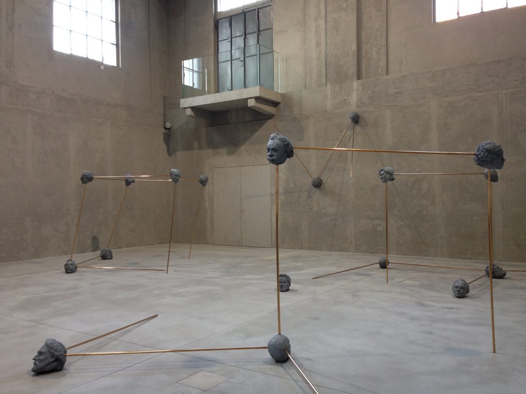
Before we entered another section of the building, a gallery-sitter/bureaucrat reminded us to not come too close to the artwork. This consisted in a series of heads made of concrete and connected by golden poles. I saw it as a metaphor of the lineage of thinking from philosopher, scientists and artists from different ages. At the same time, I couldn’t help noticing how the installation was in perfect accord to the chromatic palette of the Fondazione.
You better behave
The problem started when I asked my curator friend to take a picture of me next to the concrete head of Nietzsche, my all-time favourite philosopher. My well-mannered friend was clearly uneasy at my request. In the first picture he took of me, I had a funny face. I asked him for one more shoot.
After performing his friend duty, he excused himself with the gallery-sitter/bureaucrat who was staring at him. Is not that gallery sitters say you can’t take pictures next to the work. They just make you feel undesirable if you do. My embarrassed friend tried to make a joke about my naïf enthusiasm, but the gallery-sitter didn’t laughed. She sternly stared at him. Guilty.
It’s only then that I noticed the omnipresence of gallery-sitters. They reminded me of the understated version of the bodyguards at the entrance of a Prada shop. These guys represented the silent threat to breaking the local private laws. They silently said: you better behave.

At Fondazione Prada it was made clear that the experience of art had to be mediated by a strict set of rules. In this private space, art is exclusive: it is something you don’t photograph, you don’t interact with and you don’t even walk too close to. Art is seen as too precious for all these things, thus you can only look at it from afar.
On one hand, art viewers get treated as if they could harm the art at any time. On the other hand, there is the another meaning of the word “exclusive”. Exclusivity is creating a psychological state around art which gives added value to what you are looking at. Not from some inherent quality, but for the system you put in place that validates it.
Being aware of the political agenda
In a 2009 interview with the Telegraph about the Fondazione, Miuccia Prada said: “We have reached a great changing point in art. What interests me most is when a work of art is no longer just an object, but also touches reality and life.”
Actually, the intention behind Fondazione Prada seems to be quite the opposite. Regardless of its unassuming location, of its intriguing ambiguity, Fondazione Prada remains an elitist temple. In its sleek elegance, it’s beautiful and unwelcoming. It winks at inclusive art, but it’s exquisitely exclusive. Here art is treated as a luxury item.
A great example of exclusive art, Fondazione Prada gives us a good understanding of the threat of the enforcement of regulations and control for their own sake, and what that does to the art viewer.
This tendency doesn’t have to make us resign to the idea the experience of art will always be mediated and controlled. Rather, when we look at art, we must be aware that in the way we experience it, there is a whole set of premises at play that go well beyond the object itself — and of course well beyond the original intention of the artist. These premises are decided by those managing the containers of the art, namely the institution.
Art itself has taught us for centuries to look under the surface. We must be aware of what kind of political agenda — one of inclusiveness or exclusiveness — is in place in all sort of art spaces. This will give us an additional set of tools for understanding society at large.

